 Message Field for Jira Cloud
- Overview
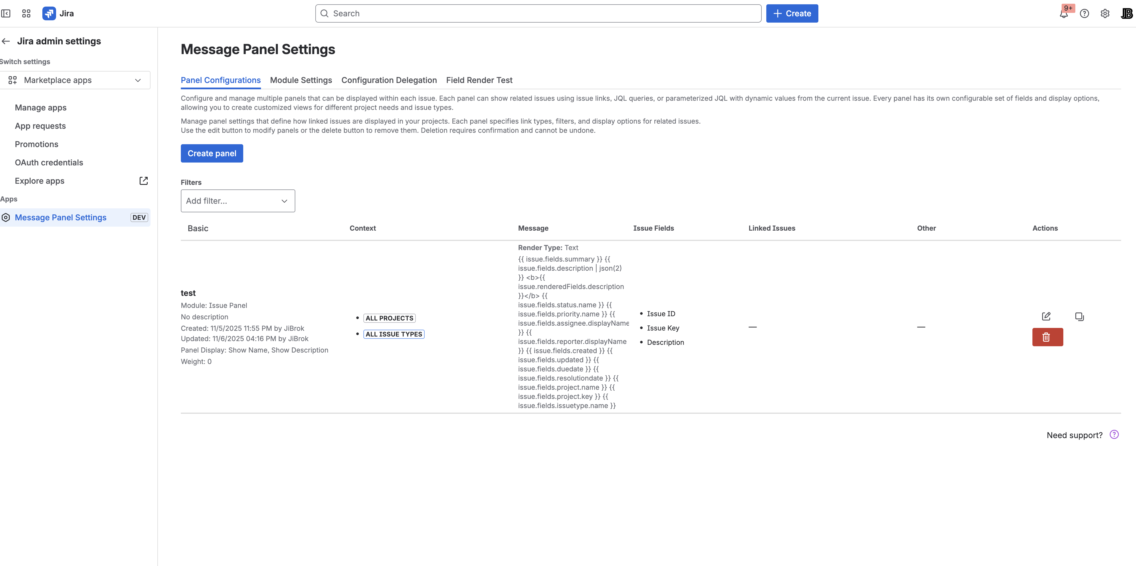
- Creating a Configuration
- Basic Settings
- Display Settings
- Display Options
- Message Type
- Modal Window Options
- Next Steps
Overview
Each panel configuration controls:
- WHERE it appears - Display Module (sidebar, activity, context, action)
- WHEN it appears - Context Filters (projects, issue types, JQL)
- WHAT it shows - Data source and message content
Creating a Configuration
- Go to Apps → Message Field Settings
- Click Create panel
- Configure settings across tabs
- Click Save
Basic Settings
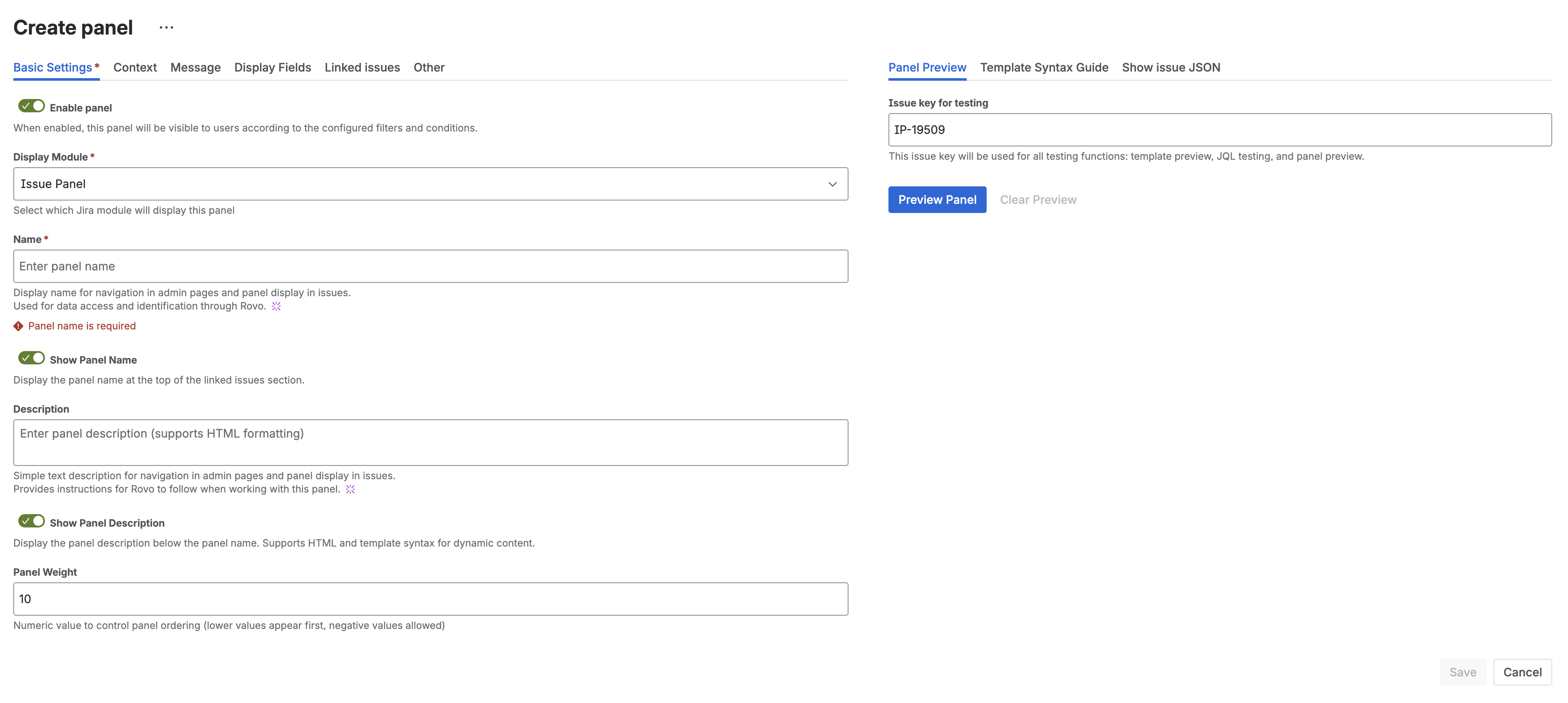
Name
- Required field
- Must be unique across all configurations
- Displayed as panel title (if “Show Name” is enabled)
- Max 100 characters
- Examples: “Blockers”, “Related Bugs”, “Epic Progress”
Description
- Optional field
- Supports dynamic templates with issue data
- Displayed below the panel title (if “Show Description” is enabled)
- Useful for admin notes or dynamic context
Example:
This issue has {{ linkedIssues | len }} related items
Enabled
Toggle to enable/disable the panel without deleting the configuration.
- Enabled - Panel is active and will display when conditions match
- Disabled - Panel is hidden but configuration is preserved
Common use cases for disabling:
- Maintenance mode - temporarily hide panels during system changes
- Staged rollout - create configurations in advance, enable when ready
- Seasonal content - disable holiday notices after the season ends
- Debugging - isolate issues by disabling panels one at a time
Display Settings
Display Module
Choose where the panel appears:
| Module | Location | Modal Support |
|---|---|---|
| Issue Panel | Right sidebar | Yes |
| Issue Activity | Activity feed tab | No |
| Issue Context | Context panel | No |
| Issue Action | Toolbar button | No |
| JSM Portal Panel | Customer portal request page | No |
| JSM Portal Footer | Portal footer area | No |
| JSM Portal Subheader | Portal subheader area | No |
| JSM Portal Subheader (Create) | Request creation form, below title | No |
| JSM Portal Footer (Create) | Request creation form, bottom | No |
Each configuration targets one module. Create multiple configurations for multiple locations.
See Modules for detailed information about each module type.
Display Limits
| Setting | Description | Range | Default |
|---|---|---|---|
| Rows Per Page | Issues shown per page in table | 1-100 | 10 |
| Max Issues | Maximum issues to load from query | 1-1,000 | 50 |
Note: Rows Per Page controls pagination display. Max Issues controls how many issues are fetched from Jira API. Set Max Issues high enough to show all relevant issues.
Weight
Controls display order when multiple panels target the same module:
- Lower weights appear first
- Negative values allowed - use them to force panels to the top
- Same weight - panels with equal weight are sorted alphabetically by name
- Range: -1000 to 1000
- Default: 0
Example:
- Panel A: weight = -10 (appears first)
- Panel B: weight = 0 (appears second)
- Panel C: weight = 100 (appears last)
Ordering strategy: Use weight increments of 10 (e.g., -20, -10, 0, 10, 20) to leave room for inserting new panels between existing ones later.
Display Options
Configure what elements appear in the panel:
| Option | Description | Default |
|---|---|---|
| Show Name | Display panel title | Yes |
| Show Description | Display description below title | Yes |
| Show Count | Display total issue count badge | Yes |
| Show JQL Link | Add link to open results in Issue Navigator | No |
Message Type
Wrap your message content in a styled Atlassian message box without writing HTML.
Message Type Options
| Type | Description |
|---|---|
| Custom | No wrapper - display message content as-is (default) |
| Info | Blue informational message with info icon |
| Warning | Yellow warning message with warning icon |
| Error | Red error message with error icon |
| Success | Green success message with checkmark icon |
| Change | Purple change/discovery message with discovery icon |
Message Title
When a Message Type other than Custom is selected, you can optionally provide a title that appears above the message content.
Example Configuration:
- Message Type: Warning
- Message Title: Attention Required
- Message:
This issue has blockers that need to be resolved
This renders as a yellow warning box with “Attention Required” as the header.
Tip: Message Type provides a no-code alternative to using
<section-message>HTML tags. Both produce the same Atlassian-styled result.
Modal Window Options
For Issue Panel module, you can display the panel content in a modal dialog instead of inline.
| Setting | Description |
|---|---|
| Show in Modal | Enable modal display mode |
| Button Text | Text for the button that opens modal |
| Button Appearance | Button style: default, primary, subtle, warning, danger |
| Modal Size | Dialog size: small, medium, large, x-large |
| Auto-Open | Automatically open modal when issue loads |
| Show Once Per Issue | Only auto-open once per session per issue |
| Modal Appearance | Visual style: default, warning, danger |
| Close Button Text | Custom text for close button |
See Modal Windows for detailed usage and examples.
Next Steps
- Testing Panels - Preview and debug your configurations
- Bulk Operations - Export, import, and manage configurations
- Data Sources - JQL, Linked Issues, or Message only
- Context Filters - Control when panels appear
- Templates - Dynamic content syntax
- Message Formats - Text, HTML, Markdown, ADF
- Modal Windows - Pop-up dialog configuration


