 Message Field for Jira Cloud
- Overview
- Enabling Modal Mode
- Modal Options
- Auto-Open Options
- Configuration Examples
- Best Practices
- Troubleshooting
- Next Steps
Display your panel content in a pop-up dialog instead of inline. Available for Issue Panel module only.
Overview
Modal windows are useful for:
- Important warnings that need attention
- Detailed information without cluttering the issue view
- Blocking notifications that require acknowledgment
- Critical instructions for specific issues
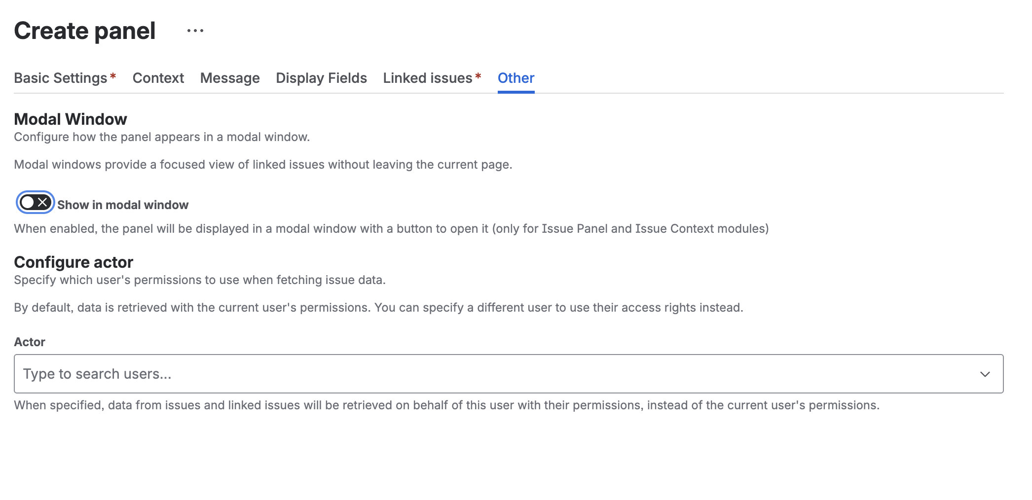
Enabling Modal Mode
- Edit your panel configuration
- Go to Other Settings tab
- Enable Show in modal window
- Configure modal options
- Save
Modal Options
Show in Modal Window
Toggle to enable modal display. When enabled:
- A button appears in the Issue Panel location
- Clicking the button opens the modal dialog
- Panel content displays inside the modal
Modal Button Text
Customize the button label that opens the modal.
- Default: “Show Information”
- Max length: 100 characters
Examples:
- “View Blockers”
- “Important Notice”
- “See Related Issues”
Button Appearance
Visual style of the open button:
| Style | Use Case |
|---|---|
| Default | Standard button |
| Primary | Main action (blue) |
| Subtle | Less prominent |
| Warning | Caution (yellow) |
| Danger | Critical (red) |
Modal Size
Control the dialog size:
| Size | Use Case |
|---|---|
| Small | Simple messages |
| Medium | Standard content |
| Large | Tables, detailed info |
| X-Large | Complex dashboards |
Modal Appearance (Color)
Set the modal header color for emphasis:
| Appearance | Color | Use Case |
|---|---|---|
| None | Default | Standard information |
| Warning | Yellow/Orange | Cautions, reminders |
| Danger | Red | Critical alerts, blockers |
Close Button Text
Customize the button that closes the modal.
- Default: “Close”
Examples:
- “Got it”
- “Acknowledge”
- “OK”
Auto-Open Options
Auto-Open Modal
Automatically open the modal when the issue loads.
Use cases:
- Critical warnings that must be seen
- Mandatory instructions
- Blocking information
Show Once Per Issue
When combined with Auto-Open:
- Modal opens automatically only once per issue during the session
- After closing, it won’t auto-open again for that issue
- User can still click the button to reopen
This prevents annoying repeated popups while ensuring users see important information.
Configuration Examples
Critical Blocker Warning
Settings:
- Data Source: Linked Issues → “is blocked by”
- Display JQL:
status != Done - Modal enabled: Yes
- Button Text: “View Blockers”
- Button Appearance: Danger
- Modal Size: Medium
- Modal Appearance: Danger
- Auto-Open: Yes
- Show Once Per Issue: Yes
Result: Red modal automatically opens showing blocking issues. Opens once per issue, users can acknowledge and continue working.
Important Instructions
Settings:
- Data Source: Empty (Message only)
- Message: Instructions text
- Display JQL:
type = "Deployment" - Modal enabled: Yes
- Button Text: “Deployment Checklist”
- Button Appearance: Warning
- Modal Size: Large
- Auto-Open: No
Result: Yellow button appears on deployment issues. Users click to view checklist.
Release Notes
Settings:
- Data Source: JQL →
"Epic Link" = {{ issue.key }} - Modal enabled: Yes
- Button Text: “View Release Items”
- Button Appearance: Primary
- Modal Size: X-Large
- Auto-Open: No
Result: Blue button on epics opens large modal with all stories/tasks in the release.
SLA Breach Alert
Settings:
- Data Source: Empty
- Message: SLA breach warning
- Display JQL:
priority = Highest AND created < -4h AND status != Done - Modal enabled: Yes
- Button Text: “SLA Alert”
- Button Appearance: Danger
- Modal Appearance: Danger
- Modal Size: Small
- Auto-Open: Yes
- Show Once Per Issue: Yes
- Close Button Text: “Acknowledge”
Result: Small red modal auto-opens on issues breaching SLA. User must acknowledge.
Best Practices
When to Use Modals
Good use cases:
- Critical blockers that need immediate attention
- Mandatory acknowledgments
- Detailed information that would clutter the issue view
- Time-sensitive warnings
Avoid for:
- General information (use inline panels)
- Frequently updated content
- Content users need to reference while working
Auto-Open Carefully
- Use sparingly to avoid annoying users
- Always enable “Show Once Per Issue” with auto-open
- Reserve for truly critical information
- Combine with specific Display JQL filters
Troubleshooting
Modal Not Opening
- Check that Issue Panel module is enabled globally
- Verify the panel’s context filters match the issue
- Ensure “Show in modal window” is enabled
Auto-Open Not Working
- Modal only auto-opens on issue load
- Check “Show Once Per Issue” - may have already shown
- Clear browser cache to reset “shown” state
- Verify Display JQL condition matches the issue
Modal Appears on Wrong Issues
Review your context filters:
- Project filter
- Issue type filter
- Display JQL condition
Next Steps
- Context Filters - Control when modals appear
- Templates - Dynamic modal content
- Modules - Other display options
- FAQ - Troubleshoot modal issues


